Before + After: Creating a Custom Boho Dining Nook
Before signing on the dotted line when we bought our condo, I had an embarrassing number of Pinterest boards that coincided with every room. Since my partner and I purchased the unit on assignment (meaning we bought it from someone who had purchased it previously from the builder during the pre-construction phase) we had no choice when it came to the layout – but we were determined to make what we had work for our lifestyle. Originally sold as a two bedroom, we requested that the builder forgo installing the wall to the second bedroom, creating a dining area that now acts as the epicentre of our space – not only do we have most meals here, but it acts as a collaborative workspace and entertaining area for our guests. With the help of a super star contractor, my mom, and a few Ikea hacks, we were able to create my DREAM dining area. Here’s how we did it!
THE INSPIRATION
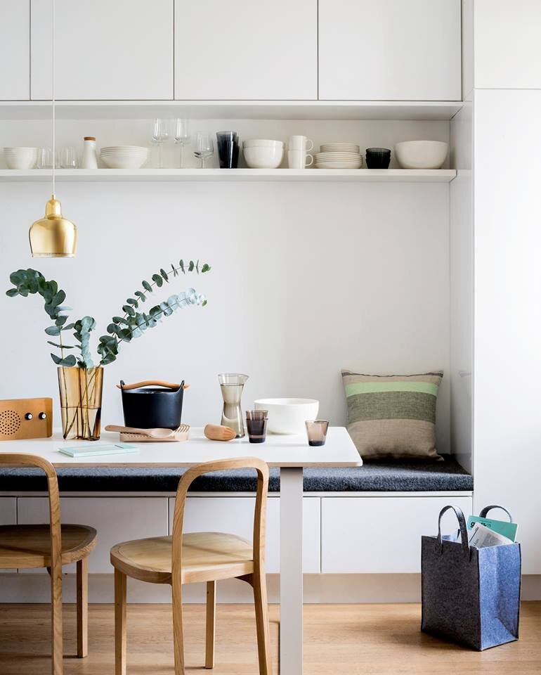
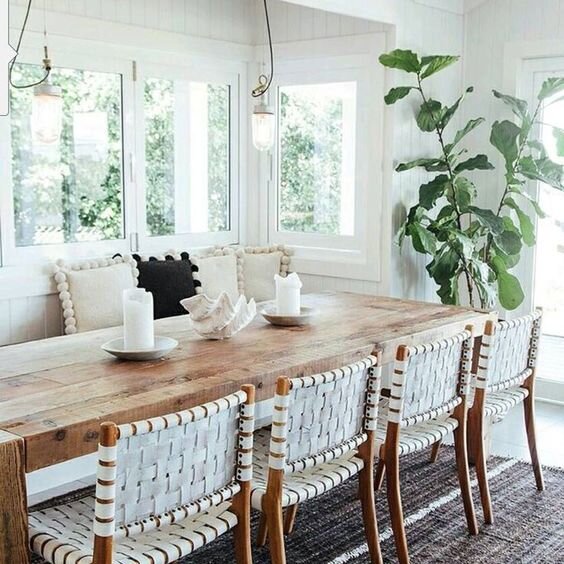
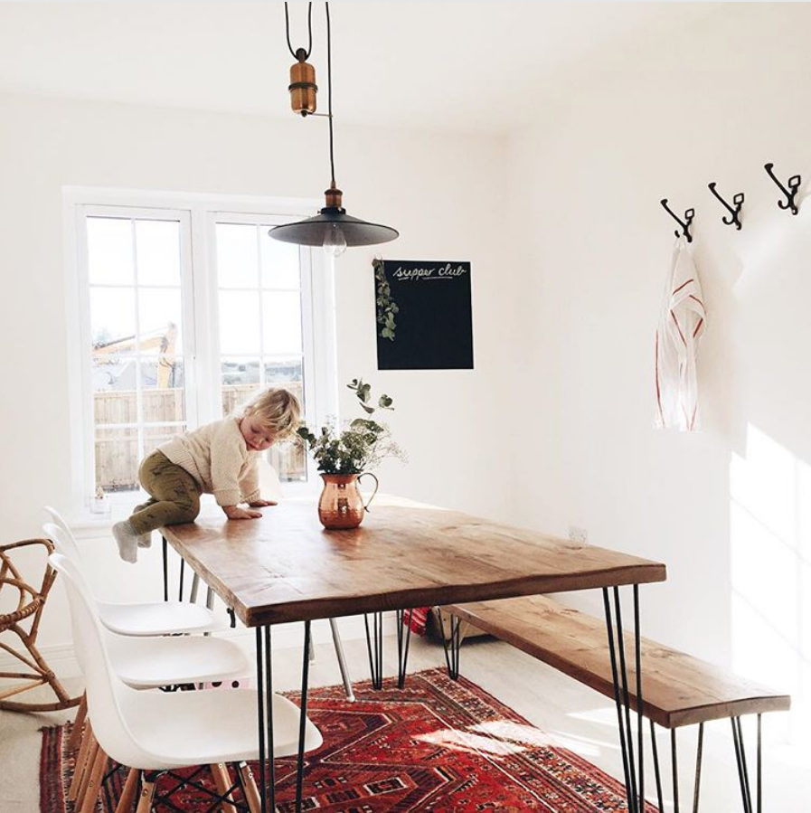
Because we purchased our condo a year before we even had a chance to see it, we had tons of time on our hands to work with the floorplan provided by the builder and source the exact materials we’d need to make the ultimate dining “room”. The first photo below was the original inspiration image I found on Pinterest, and we used that as well as the two others as a base when choosing the finishes and fabrics. We were aiming for a result that was much more beach house vibe that Scandinavian modern like the first one pictured below, but we loved the idea of having both upper and lower storage as well as mismatched accessories.
Images via SUSANNA VENTO / @THEGROVEBYRONBAY / @THISLITTLEHOUSE_
BEFORE
I wish we took a better photo of this area, but you get the idea. We were lucky that the builder agreed to leave out the wall that would have made this into a second bedroom (it spanned from the left of the window where the light switch is on the small column, to the right of the back wall with the electrical panel you see in the photo below). This way, we were able to start with a total blank canvas with no need for reconfiguring the floorplan.
THE PROCESS
I knew I wanted to make this space feel like it could easily fit into a boho beach house without forcing it too much; our condo is modern, there’s no changing that, so we had to work with the contemporary feel that all the clean lines and slick finishes created. I changed the textiles SO many times, and actually based everything around this Mali mud cloth fabric that caught my eye at Tonic Living. I mocked different combinations up in Photoshop before shopping in person, and decided to source all of the fabric from Tonic.
For the built-ins, we were set on using Ikea cabinetry as much as we could. Since our space was a bit of an awkward size and Ikea kitchen cabinetry is designed specifically to fit within their kitchen layouts, we had to improvise by adding panels to the each side of the uppers to ensure it went fully wall to wall. We used Ikea kitchen cabinetry that we flipped on its side, along with VEDDINGE panels and handles that are now unfortunately discontinued (you can find similar here).
The lower L-shaped bench doubles as storage with a piano hinge that allows the seat to flip up. We had it custom designed and built by our amazing contractor. We used a grey paint in order to keep lower maintenance than a stark white would have been – BEHR, Chic Grey.
With the help of my interior designer (aka my mom), we selected a durable grey and white Ikat inspired zig zag fabric for the seat cushions and a combination of the Mali mud cloth and a more traditional cream and white striped Olefin fabric for the back throw pillows. We wanted to be able to switch up the look of the dining area on a whim, so the double sided pillows allowed us to do this pretty easily!
Our dining table was selected WAY in advance, the Reno from Structube. This is by far the best find we’ve ever had from the brand, and people regularly ask if it’s custom. The camel coloured Acacia wood keeps the space feeling light despite having a giant piece of live edge wood as the focal point, and the powder coated hairpin legs matched perfectly with the legs of our chairs (also from Structube but discontinued now).
AFTER
The end result turned out exponentially better than we had planned for. We contemplated table size multiple times, as we wanted to be able to comfortably seat at least six, and ended up choosing the smaller version of the Reno so that we could fit an end chair on the window side. The L-shaped bench allows for one adult or two children to sit on the north side of the table, and allows for just over 5 feet of extra storage (so key in a less than 900 sqft condo!). To complete the area, we purchased two sets of pillows, one faux denim and one a light grey velvet that matches the lighter colour in the bench fabric, so we’re able to create a totally different look just by switching out/flipping around the pillows. The harvest-style table looks epic when it’s set up with family meal and our clay table ware, so look out for a post on dinner party styling tips to come in the near future!


